What is a Call to Action?
Call to Action or a CTA is a word sentence of phrase that encourage the reader to take a specific action. It is a persuasive technique use on the web, in emails, in advertisements, and on landing pages that tries to get the viewer to interact with it. In digital marketing CTAs often consist of text, a button, text in a button, and very careful styling, framing and word choice.
Calls to action come in a variety of styles, shapes, and sizes. The one unifying factor is they aim to communicate a directive. That being said not all CTAs are created equal and ineffective or poorly implemented Calls to Action can fail to have the desired result, causing you to loose prospects and potentially fail conversions. Through the course of this article we will outline why you need a good CTA, what makes an effective CTA, and help you craft one for whatever your desired action is.

Why You Need a Call to Action
An effective CTA will make the case for your product or pitch, it can persuade a reader o buy a product, grab a download, give you their email, read your article, participate in your webinar, share your content on social media and so much more.
Calls to Action are important because they make it clear to the end-user what the next step would be. They help increase click-through rates, help capture the attention of scanning readers, and helps drive them towards conversion.
For more on why you need CTAs see our dedicated blog on the topic:
Calls to Action, CTAs, & Why You Need Them

What Makes A Good CTA?
Effective Calls to Action need to strongly relate to the content on the page. If it’s an email it should answer the subject, if it’s a landing page it should be the logical conclusion, if it’s an advertisement it should be as succinct and relevant as possible.
Your CTA should have prominent framing, enough size, color, and white space to set it apart from the rest of the content and let the user know it is interactive. It needs to be visually stimulating enough to capture the attention of someone just scanning the page.

Use The Right Language
Once you have the reader’s attention it is then important to use the right words. Your text should use “active” language, create a sense of urgency in the reader, and emphasize the value your offer adds to the reader. It should be personal, foster curiosity and interest, avoid friction, and show proof where possible.
Active language should inform the user on the specific action they should take. By leveraging the reader’s fear of missing out you can leverage a sense of urgency in taking your action. By focusing on the benefits of your offer, and immediately delivering if they click through, it makes users more likely to do follow-up actions.
Getting personal allows you to give the reader a sense of ownership, it expresses the user that they have something to gain, and helps fight the instinct of avoiding loss. Common friction words include: download, buy, order, submit and other command-like instructions. Avoid these where possible and try to make your CTAs collaborative.
Finally, show proof where available. Either in the form of social proof in testimonials or shares, or empirical proof in testing or white papers. If you can back up your proposal with testimonials or fact, you are more likely to make your conversions.

Frame Your Actions
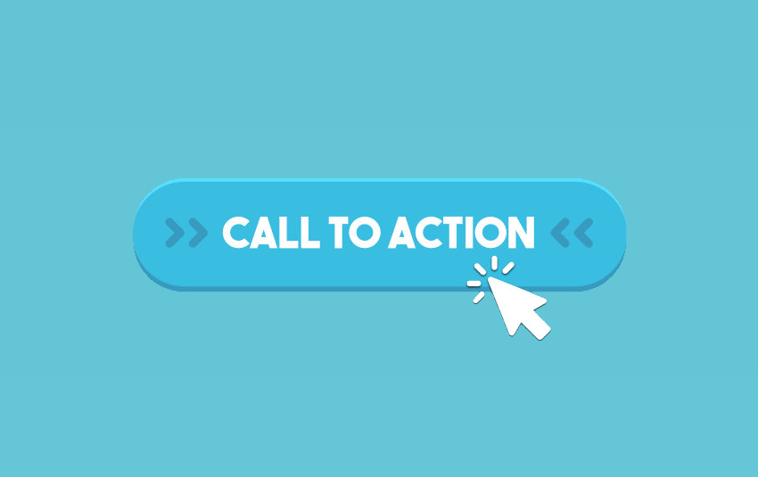
Beyond language design is an important part of your Call to Action. Your CTA needs to stand out from the page. It may seem obvious but your button needs to look like what people expect a button to look like. It should be big, it should have color, it should have rounded edges, and a smooth gradient. Familiarity breeds usability and the internet has already developed a design trend for internet buttons, use these established styles as a shortcut for communication with your readers.
Your call to actions also needs to be appropriately sized and offset from your other content. In conversion rate testing by ContentVerse they found that extra-large buttons drew the eye, helped their conversion point noticed even before the reader was convinced of the full value of converting. Make your buttons large, but appropriately sized for their content. Likewise, whitespace can help frame your CTA and can also help your action point stand out and know where they can connect.

Test Your Performance
The best way to know what works is to test and experiment with your audience. Run some A/B tests to help you figure out which Call to Action yield the best results. There are not hard rules about what makes a good CTA, as effectiveness will vary based on your goals and your audience. What may work for some may not work for others, so testing things empirically should be part of CTA action plan.

In Conclusion
Calls to Action are the main drives of click-through on the web. No matter your product or destination it is critical you get your point of action and interaction right. Tools such as Google Analytics can help you gauge their effectiveness and don’t be afraid to iterate on your CTAs as you go. Finally, as mobile audiences grow on the web, be sure to test and optimize for all the kinds of visitors you expect.
If you need help with your web development, would like to convert more, feel free to contact us and learn how we can help you make the most of your web presence.